Lit review
Okay a small lit review just to remind myself of what i learnt from reading a number of books before i think about conducting a small survey or email various companies for ideas.

# Author Richard Hollis
Review:

# Author Richard Hollis
# Hardcover: 272 pages
# Publisher: Yale University Press (April 28, 2006)
Review:
Hollis's book, while extensive in its documentation and admirable in its visual organization of the Swiss developments, comes to several conclusions which should be questioned. The first is the disproportionate and misguided prominence afforded Theo Ballmer as a prime influence stemming from his experience at the Bauhaus. Whatever Ballmer's influence as a poster designer in the 20s was, he had gotten his essential training in the Basel school, which underwent its own ongoing and largely independent modernist development, prior to Ballmer's very brief time at the Bauhaus. The Bauhaus influence is deemed minor by the emerging Basel school, and Ballmer's later influence in teaching photography and lettering has to be considered a lesser one.
Significant also is the confusion in reporting influences in development of the cutting edge Geigy Pharmaceuticals graphics program where the influences of Armin Hofmann and Emil Ruder as educators of the leading Geigy designers are missing. While this is inferred on page 162 in the statement that "the Geigy style originated in the teaching at the Allgemeine Gewerbeschule," the key influences in Basel--Hofmann and Ruder--are not mentioned.
Similarly, Hollis attributes Müller-Brockman's "conversion" to the influences of Lohse and Vivarelli, the evidence being the concert hall posters of 1951 and 52. While this is definitely a move in that direction from an earlier illustrative style, the most convincing change, and the style by which Müller-Brockman is widely known, emerged on the hiring of graduates of the Basel school under Armin Hofmann in 1955. This means that Hofmann and Ruder pre-date Müller-Brockman's mature style instead of being placed as p. 214 as a separate and later development--and not as a precursor feeding the larger Swiss development from a more humanistic perspective than the more constructivist direction of the Zürich school. One can argue about which contributed most to the international prominence of Swiss design, but Hollis's own statement p. 215 regarding the world-wide significance of Hofmann's Graphic Design Manual, Principles and Practice, on education is telling. Müller-Brockman's more objective approach was probably more influential in the world of corporate graphics.
Hollis betrays a bias, perhaps, in his strange analysis of Hofmann's Tell poster and omits such key poster achievements as the "Switzerland in the Roman Era" (1957). It is unfortunate that Hollis did not interview Armin and Dorothea Hofmann. They are few of the remaining key figures from the era of Hollis's investigation.
Contents in my pdf
INTRO
HISTORICAL INFORMATION
RESEARCH
INTERVIEWS CONDUCTED
ACTION PLAN
IDEAS GENERATION
LAYOUT AND EXPERIMENTS
FINAL STAGES
REFLECTION FINISHED PIECES/FINAL OUTCOME.
Here is a list of how i could put my pdf together as most of the research in inputted into this blog so i will have to cut and paste where it is needed as there is so much to continue with.
emil ruder
Typographer and graphic designer, born in Switzerland in 1914, helped Armin Hofmann form the Basel School of Design and establish the style of design known as Swiss Design. He taught that, above all, typography's purpose was to communicate ideas through writing. He placed a heavy importance on sans-serif typefaces and his work is both clear and concise, especially his typography.
Like most designers classified as part of the Swiss Design movement he favored asymmetrical compositions, placing a high importance on the counters of characters and the negative space of compositions. A friend and associate of Hofmann, Frutiger and Müller Brockmann, Ruder played a key role in the development of graphic design in the 1940s and 50s. His style has been emulated by many designers, and his use of grids in design has influenced the development of web design on many levels.


JOSEPH MÜLLER-BROCKMANN

As with most graphic designers that can be classified as part of the Swiss International Style, Joseph Müller-Brockmann was influenced by the ideas of several different design and art movements including Constructivism, De Stijl, Suprematism and the Bauhaus. He is perhaps the most well-known Swiss designer and his name is probably the most easily recognized when talking about the period. He was born and raised in Switzerland and by the age of 43 he became a teacher at the Zurich school of arts and crafts.

Perhaps his most decisive work was done for the Zurich Town Hall as poster advertisements for its theater productions. He published several books, including The Graphic Artist and His Problems and Grid Systems in Graphic Design. These books provide an in-depth analysis of his work practices and philosophies, and provide an excellent foundation for young graphic designers wishing to learn more about the profession. He spent most of his life working and teaching, even into the early 1990s when he toured the US and Canada speaking about his work. He died in Zurich in 1996.
ARMIN HOFMANN
By the age of 27 Armin Hofmann had already completed an apprenticeship in lithography and had begun teaching typography at the Basel School of Design. His colleagues and students were integral in adding to work and theories that surrounded the Swiss International Style, which stressed a belief in an absolute and universal style of graphic design. The style of design they created had a goal of communication above all else, practiced new techniques of photo-typesetting, photo-montage and experimental composition and heavily favored sans-serif typography.
He taught for several years at the Basel School of Design and he was not there long before he replaced Emil Ruder as the head of the school. The Swiss International Style, and Hofmann, thought that one of the most efficient forms of communications was the poster and Hofmann spent much of his career designing posters, in particularly for the Basel Stadt Theater. Just as Emil Ruder and Joseph Müller-Brockmann did, Hofmann wrote a book outlining his philosophies and practices. HisGraphic Design Manual was, and still is, a reference book for all graphic designers.


More Info:
Poster Collection at YouWorkForThem
Graphic Design Manual on FlickR
His Work, Quest and Philosophy at Unit Editions
Graphic Design Manual on FlickR
His Work, Quest and Philosophy at Unit Editions
Next Steps...
Talking to Paul at uni, i have realised that i really should narrow and pin point what i really want to achieve from this project its all good that i keep adding stuff and collecting things but its no use if i cant put them to practice.
Think more beyond the modernism aesthetics and delve more into the historical , political sides of things look at the tools used and there processes and see what i find.
Think more beyond the modernism aesthetics and delve more into the historical , political sides of things look at the tools used and there processes and see what i find.
Wim Crouwel
“It was actually quite difficult to avoid Wim Crouwel’s work. In the 1960s the Netherlands was inundated with posters, catalogues, stamps designed by him, even the telephone book.” - Karel Martens | |
Wim Crouwel : architectures typographiques 1956-1976 | |
The contrast between Crouwel as a lyrical expressionist painter and objectivating functionalist designer couldn’t be more extreme. As a designer he felt related to the Bauhaus ideas, the swiss-inspired international style. He was fascinated by the rational aspect in Bauhaus typography, which he discovered through Karl Gerstner’s and Gerard Ifert’s work. | |
Although his ideas were bauhaus-related, unlike many Crouwel was not a dogmatist. He was fascinated by the ideas about serial and mass production, as he stated “we need the machine since we have no time”. But he also believed “the machine cannot replace the precision of the human eye and human feeling”.* Crouwel’s work has always consisted of these two essential elements: the emotional aspect and the rational one. | |
Vormgevers | |
CROUWEL AT THE VAN ABBE MUSEUM In 1954 Crouwel designed the catalogues and posters for the Van Abbe Museum. He took the position that the design of a catalogue or poster must not be an interpretation of the artist’s ideas. It should merely provide relevant information to the reader, without ornaments or styling as this would only lead to confusion. The catalogue should not refer to the artist as an individual, but to the museum and its range of activities. The development of the programme as a whole is more important than creating the best poster ever for each new project. | |
Eduard de Wilde, Director of the Van Abbe Museum at the time Crouwel was asked for this task, remembers he found himself in an ambiguous situation. “Crouwels’s position of subjecting highly different appearances of art under the same typographic style would not be acceptable to some artists. But i also had to appreciate that transferring most different artistic trends and tem-peraments into typography might lead to a typographic chaos.” * | |
 Leger | |
MODERNIST, FUNCTIONALIST, PURIST Crouwel is a modernist and impressed by a typeface like Helvetica, which was more neutral than any other typeface. “A face shouldn’t have a meaning in itself, the meaning should be in the content of the text.”* In his work Crouwel chose sans-serif faces that allowed numerous combinations, like Gill (Van Abbe museum) and Universe (Stedelijk). The essential information was set in one returning typeface and the title of the exhibition slightly reflected the feel of the exhibition. He looked at the work of the artist, got an impression and tried to translate it typographically. An example of this way of working is found in the exhibition about Leger. Leger’s work could be recognized by its heavy lines around the images. This influenced him to create the word Leger with thick black lines so it would dominate the poster. Crouwel always searched for the abstract, something that would strike the eye. | |
Licht/kunst | |
Hussem en Bouthoom | |
Met textiel | |
 Zeefdrukaffiches | |
NEW ALPHABET Besides printwork Crouwel has designed several font sets, of which the New Alphabet (1967) is best known. This typefaces was developped after seeing the first digital typesetters at a print exhibition in Germany. The digital production of the Garamond, as presented on this exhibition looked horrible to him. The roundings of several sizes of a typeface were not alike, because of the small amount of pixels used, as you could see when the letters were enlarged. | |
New alphabet, an introduction for a programmed typography | |


Wim Crouwel advice for young designers
‘I’m very jealous of young designers starting out now – on the one hand,’ explains Wim Crouwel. ‘On the other hand, it’s becoming more difficult to find your own way.’
In this video, Wim Crouwel offers advice to young designers and creatives
Wim Crouwel a graphic odyssey 30.03.- 03.07.11
On the day of the visit i didn't know what to expect as looking at books and online all works seem similar but different because of its colour used, typefaces, the way it was printed or produced etc.
So i wanted to see work this work in person as i could travel across Europe or the world to see artists works in person i wish i could.
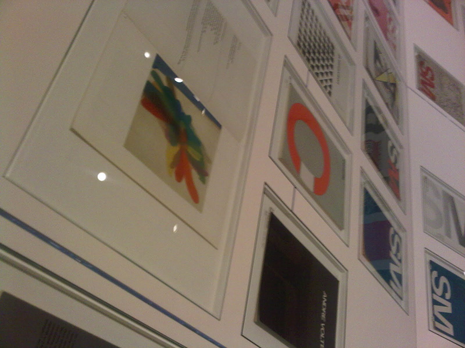
Here are a few snaps as you were not allowed to take photos. lol


So i wanted to see work this work in person as i could travel across Europe or the world to see artists works in person i wish i could.
Here are a few snaps as you were not allowed to take photos. lol


Web links of interest
Similar works done by non- famous artist's
Here is work done by people like myself who have a huge interest and love for modernist art.
As you can see these works are very similar to the modernists design throughout that era.


brainstorming
MODERNISM
grid structures
layouts
asymmetric layouts
simplicity
colour always the same black, white, red, blue etc
typefaces - Helevtica, Akzidenz Grotesk
artists/designers/typographers
shapes, themes
manifesto's
tool used
techniques
processes
quotes
political information things on about the time of the movements
research people in today's society that may have relevance to my project
influences and principles behind each movement
Thoughts...
Okay...
After visualising a few things about this project I need to go back to the drawing board after comments from tutors and marks I received back form the proposal, i need to narrow it down to something specific as this project as a whole is full of alot of information and i don't really want to study it all, as it may have no relevance to me.
After visualising a few things about this project I need to go back to the drawing board after comments from tutors and marks I received back form the proposal, i need to narrow it down to something specific as this project as a whole is full of alot of information and i don't really want to study it all, as it may have no relevance to me.
Swiss Design
The Swiss Style also known as the International Typographic Style, is a graphic design style developed in Switzerland in the 1950s that emphasizes cleanliness, readability and objectivity.
Hallmarks of the style are asymmetric layouts, use of a grid, sans-serif typefaces like Akzidenz Grotesk, and flush left, ragged right text. The style is also associated with a preference for photography in place of illustrations or drawings. Many of the early International Typographic Style works featured typography as a primary design element in addition to its use in text, and it is for this that the style is named.


“The Swiss style is also associated with a preference for photography in place of illustrations or drawings. Many of the early International Typographic Style works featured typography as a primary design element in addition to its use in text, and it is for this that the style is named”
(http://en.wikipedia.org/wiki/International_Typographic_Style)


De Stijl
The style was founded in Holland in 1917by Theo
van Doesburg and Piet Mondrain to promote their
use of geometric and abstract shapes and colours
based on the idea of universal harmony. Their ideas
extended to architecture and design as well as
painting and Van Doesburg 1n 1919 designed a new
typographic alphabet.
Subscribe to:
Posts (Atom)